Two Days with The Echo Nest

Last week I had the extreme pleasure of heading over to The Echo Nest for a couple of days to help out with a tiny project. It was one of the most rewarding experiences of my professional life. I feel like I have a new crush.

I learned about The Echo Nest through their developer API in 2012, almost two years ago to date. I thought it was one of the most awesome things I had ever worked with:

Echo Nest really took me by surprise. As a service, they gather a lot of interesting data on all music objects - tracks, albums, artists. I was astounded at the quality of data available for each track, and I was only scratching the surface of this rich and cavernous platform. Each song returned from Echo Nest had data on intrinsic musical properties like pitch, key, time signature, speechiness, danceability, a property called ‘hotttness’ and tempo which is ultimately what I used for this project. Where else do you find all that data about one song in one place? It’s like you think you know everything about your favorite song, but there are all these aspects that you can’t possibly know - how can you divine such deep analysis just by listening? This is definitely the coolest data I have ever come across in my entire life, and I’ve synthesized porphyrin.

I was overjoyed when the opportunity to work with them for a couple of days presented itself, because I’d been a fan for a very long time. I had a great time pairing with one of their engineers, and was very proud the work we did. I actually love pairing because working 1:1 means I’m not as afraid to ask questions or take risks, once I get comfortable.

The energy at The Echo Nest office was spirited and enthusiastic; less like an office and more like a hack day, which actually reminded me a lot of the atmosphere at Science Hack Day, where I left feeling similarly empowered. After the week wrapped up, while chatting with another engineer, the topic turned to music rediscovery and self-identity, something I am very obsessed with. Not only did we share the same ideas and values, but it turned out that we had both already built prototypes, and that there are others at The Echo Nest that would be interested in working on this as well. I left feeling super excited over what we’re going to build together.
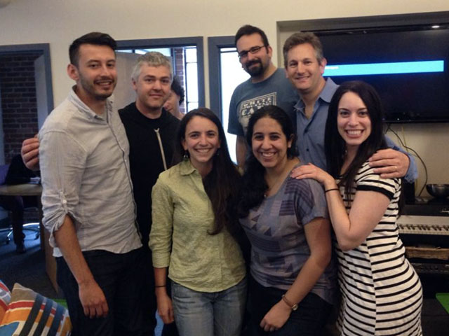
With The Echo Nest

Tasty Stacks

→ An audio version of this article is available.

This past weekend I gave my first talk, Tasty Stacks, at !!Con hosted at Hacker School in New York. Tasty Stacks is about lexical gustatory synesthesia, how it affects me as a developer, and how the current ecosystem of development tools and processes tastes to me.

Please watch “Tasty Stacks!” on Vimeo →

Tasty Stacks started out as a humble blog post about lexical gustatory synesthesia. I adapted it to a sub-5 minute Pecha Kucha talk for my web dev chapter at work. For !!Con, I maintained a similar format but focused its scope to web development. I was shocked when I learned that my talk proposal was accepted, and spent that entire weekend swathed in blankets, overreacting.

I had a Chloe-amount of doubts as to whether it would be any success at all. I was nervous that it wasn’t technical enough, and that the audience, comprised of people who are all much smarter than me, would realize that I am actually very bad at programming, that they would recognize syntax errors, or be hyper-aware of how inaccurate I am when I explain things. I listened to a lot of Moth podcasts and determined that I had no choice but to own my limitations and approach it as more of a visual essay than a talk talk. This helped me relax long enough to eke out a couple of sentences at a time over the course of several weeks while primarily sitting in coffee shops, eating my hair, and listening to Suedehead.

Another hurdle to public speaking, or even making friends, is that I am supremely uncomfortable being myself. Maybe you are too, but you’re an adult and you can handle it. I can’t. I’ve been struggling with this for a while, but it’s gotten very bad this year. The nagging suspicion that people don’t want to interact with me because I’m not worth talking to, that all my interactions are perfunctory because people spend our whole conversation wanting to exit it in order to talk to someone prettier, smarter, more positive, more relevant, more interesting, is my greatest insecurity. I felt an overwhelming guilt that I would be forcing people to pay attention to me when we both would prefer that I disappear, and that I couldn’t do that to people, and that I’m in no shape to give this talk or even have any friends.

In order to mollify this terror, at least, for the scope of the talk, I decided to treat the whole thing as Acting! I performed in character, playing the role of someone who is very confident in their ability to give this talk; a person without problems, someone people want to listen to. It was liberating that the audience didn’t know that I’m actually a broken person who regularly walks home alone over bridges and finds weekends difficult and isolating because of the unstructured time. I can’t apply this to my personal life because everyone knows what I really am, and it would be weird if I were “on” all the time. Being in character helped tremendously with my nerves, and I did not fear losing control of any of my bodily functions. During my preparation, when I felt paralyzed by my inability to write my talk and assemble my slides, approaching the content as a script for a character who isn’t me and the slides as set design helped me move forward as well.

As for !!Con, it was a great atmosphere, there was a lot of brilliant content, and I was proud to be a part of it. Chris Martens even did sketch notes. Nobody has ever sketch noted me before until now. I am grateful to the organizers: Lindsey Kuper, Alex Clemmer, Julia Evans, Erty Seidel, Maggie Zhou, and Leo Franchi for giving me this opportunity and for making me feel comfortable and accommodated. I would also like to extend thanks to Danielle Sucher; I wouldn’t have known about the event without seeing her tweets. And I would also like to thank Vince Allen, for presenting the opportunity for me to turn my blog post into a Pecha Kucha talk in the first place, and for encouraging me to practice my talk in front of our web dev chapter, even though I was scared.

Please oh please watch “Tasty Stacks!” on Vimeo →

Uptight

→ An audio version of this article is available.

Recently, I noticed that Chrome stopped heeding the contents of my user stylesheet. Predictably, this drove me crazy, so I wrote a Chrome extension to reintroduce that capability. Now I can relax again, except for the fear that it’s broken for everyone but me, and that it’s a meme telling everyone I’m a bad developer.

Visit Uptight on GitHub →

In the good aul’ days, you were able to add whatever CSS you desired to ~/Library/Application Support/Google/Chrome/Default/User StyleSheets/Custom.css, and Chrome would obey those CSS rules. You just needed to know a little bit of CSS, and not even good CSS, because this is a unique case where specificity is !important. You were able to customize your browsing experience with the degree of control you desired. This wasn’t an advertised or even easily accessible feature, but I wrote a bash alias to handle the mess of accessing the cumbersome file path.

User stylesheets are popularly used to theme developer tools so that they match settings of one’s text editor for a more comfortable debugging experience. A workaround for adding this back to Chrome exists, but it only targets the developer tools, and I’m a control freak and I use my user stylesheet to hide everything. “There’s nothing that can’t be solved with a user stylesheet!” I would think to myself when people complained about ads or promoted tweets (another form of ads), but I never say it out loud because it actually can’t solve the problem of Javascript-injected CSS that is added after the user stylesheet is loaded.

When I was on Facebook I used my user stylesheet to hide the left and right columns on the home page, leaving only the activity feed. I’m not on Facebook anymore because freedom fighters don’t use Facebook, so I can’t show you how much more focused it looked. I tried to make Facebook responsive, but, if I recall correctly, I wasn’t able to target widths on the container selectors because they inject those CSS values with Javascript.

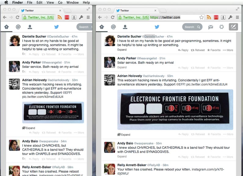
On Twitter, I use my user stylesheet to hide promoted tweets, the discover tab, the mostly useless sidebar, and most importantly, to make it roughly responsive enough:

Screenshot of responsive Twitter

My user stylesheet also removes that nosy grid of most-visited sites on the Chrome home page.

My favorite use case of my user stylesheets is that I hide every Buzzfeed, Gawker, Huffington Post, and Cracked URL from my browser. Its benefit is especially surreal with the Huffington Post Twitter feed. Without URL context, you can see it for the garbage that it is:

HuffPo is shite

I understand that vendors can do whatever they want to control how you experience the web, because it is their software, their product, but removing user stylesheets feels sooo un-web to me, which is irony. A browser’s largest responsibility is to give people access to the web. It’s like the web is this open hand, but software is this closed fist. If I wanted to hide the mostly useless sidebar on twitter.com or the shitty everything on facebook.com, I can do that on the web by editing my user stylesheet, regardless of how these providers want me to use their products. I don’t have that level of control with traditional desktop software or a so-called native mobile app.

It was already convoluted and poorly-documented enough to access Chrome’s user stylesheets, but I’m nervous that by removing them entirely, people will forget that it’s an option. It provides another hurdle to customization, and I worry that when a browser takes these things away, people won’t know how easily the web can be customized, and it will become another closed fist.

Tagged with web