Uptight
→ An audio version of this article is available.
Recently, I noticed that Chrome stopped heeding the contents of my user stylesheet. Predictably, this drove me crazy, so I wrote a Chrome extension to reintroduce that capability. Now I can relax again, except for the fear that it’s broken for everyone but me, and that it’s a meme telling everyone I’m a bad developer.
In the good aul’ days, you were able to add whatever CSS you desired to ~/Library/Application Support/Google/Chrome/Default/User StyleSheets/Custom.css, and Chrome would obey those CSS rules. You just needed to know a little bit of CSS, and not even good CSS, because this is a unique case where specificity is !important. You were able to customize your browsing experience with the degree of control you desired. This wasn’t an advertised or even easily accessible feature, but I wrote a bash alias to handle the mess of accessing the cumbersome file path.
User stylesheets are popularly used to theme developer tools so that they match settings of one’s text editor for a more comfortable debugging experience. A workaround for adding this back to Chrome exists, but it only targets the developer tools, and I’m a control freak and I use my user stylesheet to hide everything. “There’s nothing that can’t be solved with a user stylesheet!” I would think to myself when people complained about ads or promoted tweets (another form of ads), but I never say it out loud because it actually can’t solve the problem of Javascript-injected CSS that is added after the user stylesheet is loaded.
When I was on Facebook I used my user stylesheet to hide the left and right columns on the home page, leaving only the activity feed. I’m not on Facebook anymore because freedom fighters don’t use Facebook, so I can’t show you how much more focused it looked. I tried to make Facebook responsive, but, if I recall correctly, I wasn’t able to target widths on the container selectors because they inject those CSS values with Javascript.
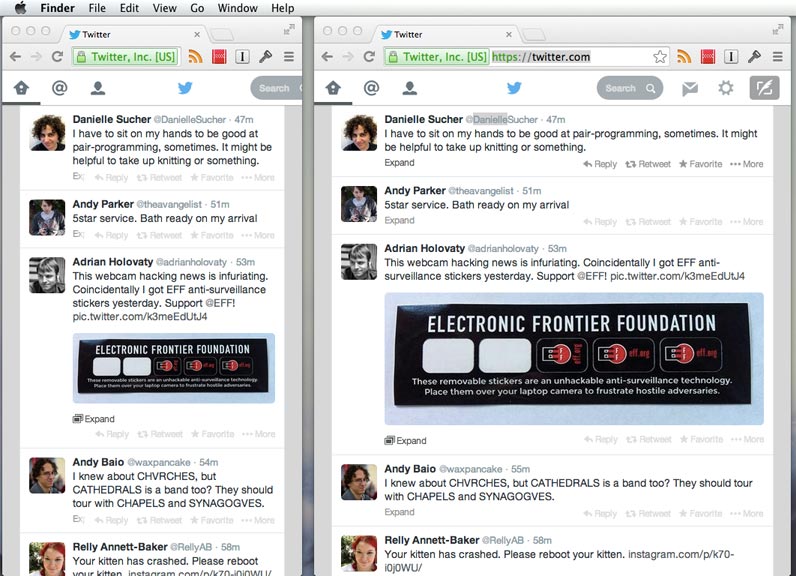
On Twitter, I use my user stylesheet to hide promoted tweets, the discover tab, the mostly useless sidebar, and most importantly, to make it roughly responsive enough:

My user stylesheet also removes that nosy grid of most-visited sites on the Chrome home page.
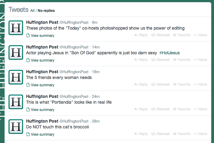
My favorite use case of my user stylesheets is that I hide every Buzzfeed, Gawker, Huffington Post, and Cracked URL from my browser. Its benefit is especially surreal with the Huffington Post Twitter feed. Without URL context, you can see it for the garbage that it is:

I understand that vendors can do whatever they want to control how you experience the web, because it is their software, their product, but removing user stylesheets feels sooo un-web to me, which is irony. A browser’s largest responsibility is to give people access to the web. It’s like the web is this open hand, but software is this closed fist. If I wanted to hide the mostly useless sidebar on twitter.com or the shitty everything on facebook.com, I can do that on the web by editing my user stylesheet, regardless of how these providers want me to use their products. I don’t have that level of control with traditional desktop software or a so-called native mobile app.
It was already convoluted and poorly-documented enough to access Chrome’s user stylesheets, but I’m nervous that by removing them entirely, people will forget that it’s an option. It provides another hurdle to customization, and I worry that when a browser takes these things away, people won’t know how easily the web can be customized, and it will become another closed fist.